MEST2 Print Brief
Research

1.
- How many of the 12 key conventions of magazine covers can you see?
-Title of publication: "BFI FILM LONDON FESTIVAL"
-Central Image: Image of a face which takes up the whole front cover.
-Flash/Cover/Sell line: "In partnership with..."
-Colour scheme: The colour scheme is bright and draws your attention to the title as the title is the only thing on the front cover that consists of colour. The colour tone is very cool since there's more blues/purples however you can also see some reds/oranges which catches your attention right in the centre of the cover.
-Name checks: The BFI logo may account as a name check as it is a clearly showing the territory and nature of the festival.
-Date: the date of the festival is written right below the title.
- In what way does this print product differ from a traditional magazine cover and how have the designers made this programme visually interesting?
This print product differs from a traditional magazine cover because the title is placed in the middle rather than right at the top and there isn't much writing or 'flash lines' to divert the readers attention. It is concise and gives the most important information, e.g. the date of the film festival. Furthermore, the designers have made this programme visually interesting by making the central image cover the whole front cover. However it is black and white but by making the title transparent to the image in colour they've made it original and modern.
2.
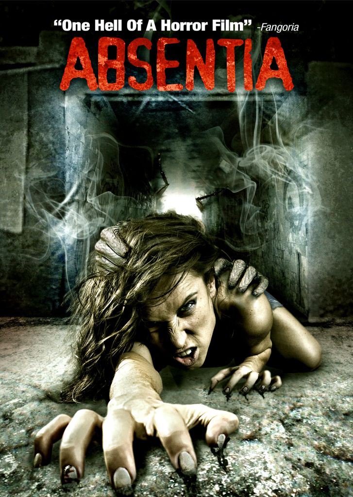
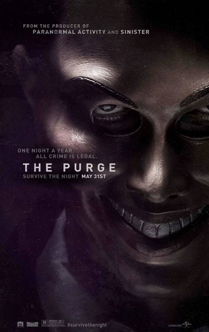
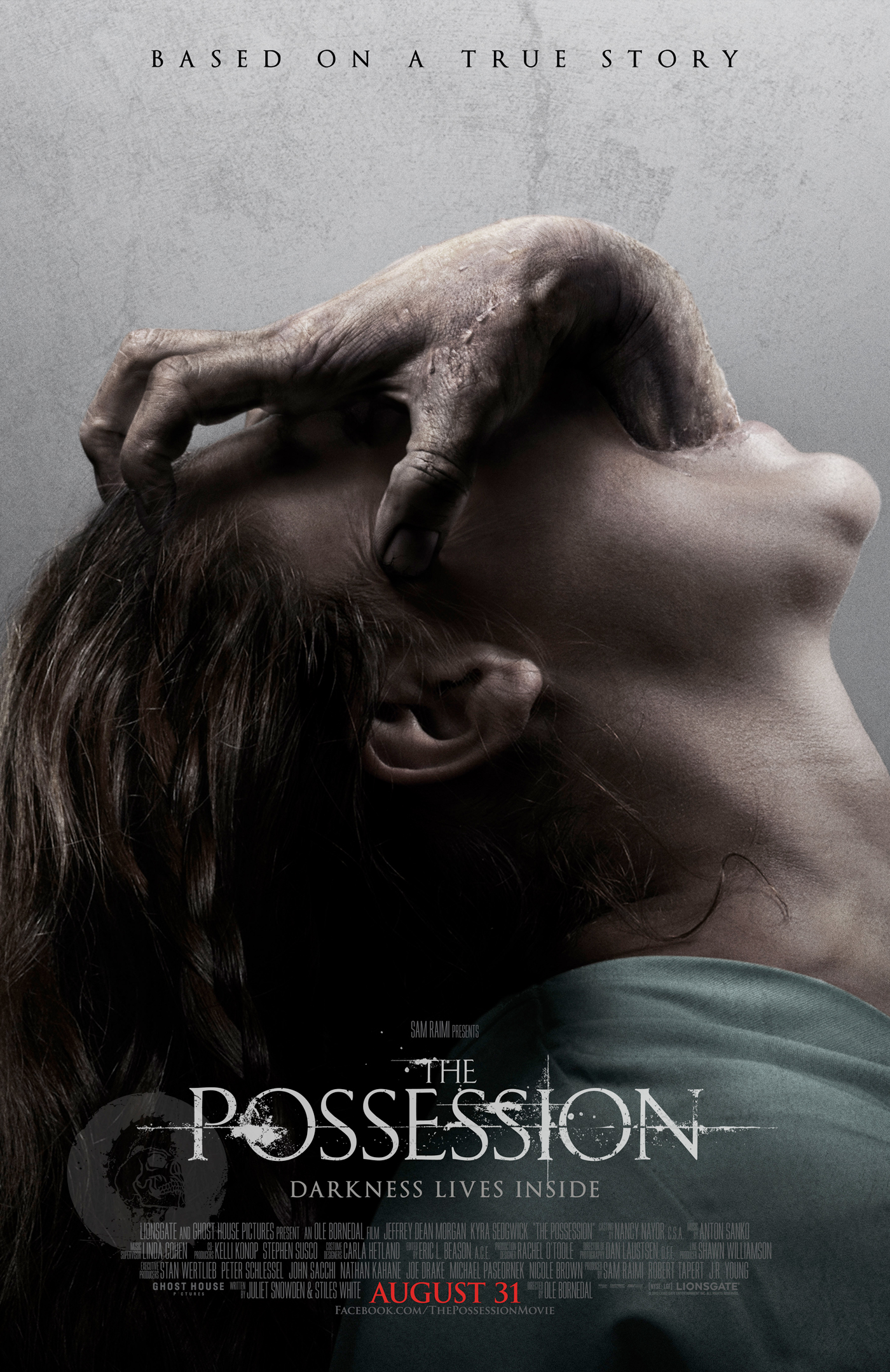
- Find 5 arts centre or cinema programmes/brochures aimed at a similar target audience to your project (arthouse cinema), For each one, pick out one design idea that you could use in your own print work.
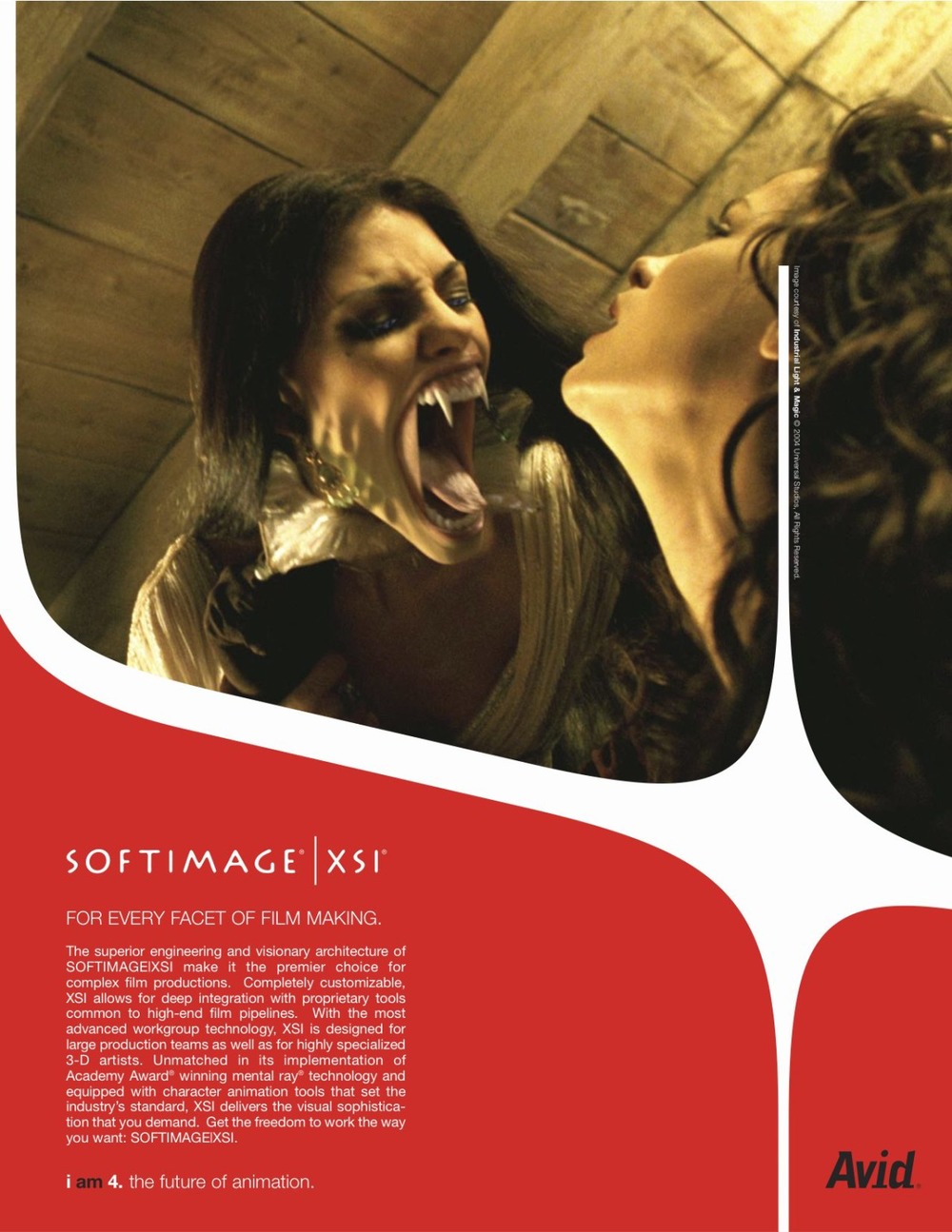
The use of the image at the top and the title/writing at the bottom is something different and I'd like to try it out for my own print work.
The colour scheme on this front cover is something I'd like to have on my print work because the central image consists of cool tones and dark colours whereas the title is in red which makes it stand out.
The whole front cover consists of the central image which is also the main character, I'd like to use this design on my print work as its concise, furthermore the title is in the middle which is also a visually appealing design I may consider.
The slogan is at the top of the front cover which makes it visually interesting and the layout looks simple yet unique. The layout of this front cover is what I hope my print work resembles in some aspects.

The colour scheme on this is also like the one I mentioned above however this time the whole cover is in black and white but the dress the character is wearing stands out and draws our attention. I would like to use this idea to get a 'pop' of colour.
- Find at least 5 contents pages from arts programmes or magazines. How are contents pages designed? How do they use a combination of text and images to create an effective design?

This contents page consists of many pictures, the images are bolder and more visible than the writing. This is a clever technique as people tend to go with what is more visually appealing. Therefore making the images from the different productions more apparent will help the reader of the brochure know what type of film they'd like to read about.

This contents page focuses on four main images rather than including them all in, this helps prevent the page from being overcrowded and confusing. By choosing a few images rather than them all makes the design more simple and easy to understand for the reader.

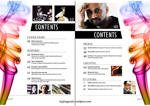
This contents page follows a similar design as the one above, however, the page numbers and titles are made more visible since they are in bright colours and bigger font. This is also crucial as it helps the reader find the thing they want to read about without any hassle.
This contents page catches your attention due to the use of bright colours, this is important as bright colours help to make the page stand out and intrigue readers.

This contents page doesn't follow the traditional contents page layout, it is modernised and once again colourful which helps draw attention. Furthermore, the different characters from different productions are put into bubbles with the page number detailing the film they're in next to them on one side whereas titles an brief summaries are on the other side. This technique helps make the contents page easy to follow.
Photoshoot
1) Which of your main characters will appear on the front cover of your programme?
The main protagonist Amelia will appear on the front cover of our programme.
2) What image or images do you need for the contents page?
We want the front covers of all the productions on our contents page, however, we may only choose our favourite ones rather than them all to prevent the contents page from being overcrowded.
2) What image or images do you need for the contents page?
We want the front covers of all the productions on our contents page, however, we may only choose our favourite ones rather than them all to prevent the contents page from being overcrowded.
3) What image or images will you use for the double-page spread?
- Amelia at the graveyard
- Amelia and Mr. Reynolds at the office
- Mental Hospital
- The drug
4) Write a shot list for the photoshoot. Make sure you plan a variety of camera shots you will look to capture - medium shots, close-ups etc.
- Long shot of Amelia in white gown holding cup with the drug inside it fizzing
- Close-up of the drug
- Wide shot of the hospital
- Over-the-shoulder shot of Amelia at the office with Mr.Reynolds
5) What costume, props or make-up will you require for the photoshoot?
- White gown
- Make-up for Amelia to make her look ill
- White contacts
- Drug (fizzing paracetamol)
- Lab coat
- Glasses
First and foremost we are going to talk to our actors who will be playing the roles and find out when they are free then we are going to make a list and buy the things necessary for the shoot.
No comments:
Post a Comment